David Sanchez
2025-10-20
Reflection :
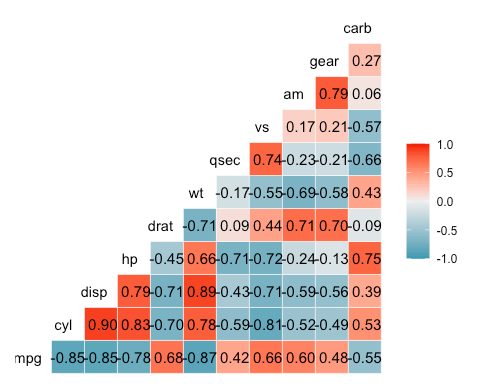
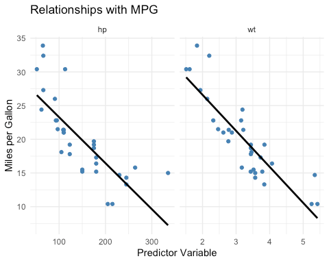
Moved up my reflection so that it is easier to access to the reader but the following is what i noticed as a result of the outputted code. Horsepower and weight both show strong negative correlations with mpg, meaning that as either variable increases, fuel efficiency decreases. The facet plots made it easy to compare the strength of these relationships side by side, clearly showing how weight has a slightly stronger effect on MPG than horsepower. Following Few’s clean design principles, using minimal colors, clear labels, and simple layouts, helped keep the visualization focused on the data and made the patterns easier to interpret.
Code and Visuals :
# Step 1
library(ggplot2)
library(dplyr)
##
## Attaching package: ‘dplyr’
## The following objects are masked from ‘package:stats’:
##
## filter, lag
## The following objects are masked from ‘package:base’:
##
## intersect, setdiff, setequal, union
library(tidyr)
library(GGally)
library(gridExtra)
##
## Attaching package: ‘gridExtra’
## The following object is masked from ‘package:dplyr’:
##
## combine
# Step 2
data <- mtcars
head(data)
## mpg cyl disp hp drat wt qsec vs am gear carb
## Mazda RX4 21.0 6 160 110 3.90 2.620 16.46 0 1 4 4
## Mazda RX4 Wag 21.0 6 160 110 3.90 2.875 17.02 0 1 4 4
## Datsun 710 22.8 4 108 93 3.85 2.320 18.61 1 1 4 1
## Hornet 4 Drive 21.4 6 258 110 3.08 3.215 19.44 1 0 3 1
## Hornet Sportabout 18.7 8 360 175 3.15 3.440 17.02 0 0 3 2
## Valiant 18.1 6 225 105 2.76 3.460 20.22 1 0 3 1
str(data)
## ‘data.frame’: 32 obs. of 11 variables:
## $ mpg : num 21 21 22.8 21.4 18.7 18.1 14.3 24.4 22.8 19.2 …
## $ cyl : num 6 6 4 6 8 6 8 4 4 6 …
## $ disp: num 160 160 108 258 360 …
## $ hp : num 110 110 93 110 175 105 245 62 95 123 …
## $ drat: num 3.9 3.9 3.85 3.08 3.15 2.76 3.21 3.69 3.92 3.92 …
## $ wt : num 2.62 2.88 2.32 3.21 3.44 …
## $ qsec: num 16.5 17 18.6 19.4 17 …
## $ vs : num 0 0 1 1 0 1 0 1 1 1 …
## $ am : num 1 1 1 0 0 0 0 0 0 0 …
## $ gear: num 4 4 4 3 3 3 3 4 4 4 …
## $ carb: num 4 4 1 1 2 1 4 2 2 4 …
# Step 3
cor_matrix <- cor(data)
round(cor_matrix, 2)
## mpg cyl disp hp drat wt qsec vs am gear carb
## mpg 1.00 -0.85 -0.85 -0.78 0.68 -0.87 0.42 0.66 0.60 0.48 -0.55
## cyl -0.85 1.00 0.90 0.83 -0.70 0.78 -0.59 -0.81 -0.52 -0.49 0.53
## disp -0.85 0.90 1.00 0.79 -0.71 0.89 -0.43 -0.71 -0.59 -0.56 0.39
## hp -0.78 0.83 0.79 1.00 -0.45 0.66 -0.71 -0.72 -0.24 -0.13 0.75
## drat 0.68 -0.70 -0.71 -0.45 1.00 -0.71 0.09 0.44 0.71 0.70 -0.09
## wt -0.87 0.78 0.89 0.66 -0.71 1.00 -0.17 -0.55 -0.69 -0.58 0.43
## qsec 0.42 -0.59 -0.43 -0.71 0.09 -0.17 1.00 0.74 -0.23 -0.21 -0.66
## vs 0.66 -0.81 -0.71 -0.72 0.44 -0.55 0.74 1.00 0.17 0.21 -0.57
## am 0.60 -0.52 -0.59 -0.24 0.71 -0.69 -0.23 0.17 1.00 0.79 0.06
## gear 0.48 -0.49 -0.56 -0.13 0.70 -0.58 -0.21 0.21 0.79 1.00 0.27
## carb -0.55 0.53 0.39 0.75 -0.09 0.43 -0.66 -0.57 0.06 0.27 1.00
ggcorr(data, label = TRUE, label_round = 2, hjust = 0.75)
model <- lm(mpg ~ hp + wt, data = data)
summary(model)
##
## Call:
## lm(formula = mpg ~ hp + wt, data = data)
##
## Residuals:
## Min 1Q Median 3Q Max
## -3.941 -1.600 -0.182 1.050 5.854
##
## Coefficients:
## Estimate Std. Error t value Pr(>|t|)
## (Intercept) 37.22727 1.59879 23.285 < 2e-16 ***
## hp -0.03177 0.00903 -3.519 0.00145 **
## wt -3.87783 0.63273 -6.129 1.12e-06 ***
## —
## Signif. codes: 0 ‘***’ 0.001 ‘**’ 0.01 ‘*’ 0.05 ‘.’ 0.1 ‘ ‘ 1
##
## Residual standard error: 2.593 on 29 degrees of freedom
## Multiple R-squared: 0.8268, Adjusted R-squared: 0.8148
## F-statistic: 69.21 on 2 and 29 DF, p-value: 9.109e-12
# Step 4
p1 <- ggplot(data, aes(x = hp, y = mpg)) +
geom_point(color = “steelblue”) +
geom_smooth(method = “lm”, color = “black”, se = FALSE) +
labs(title = “MPG vs Horsepower”, x = “Horsepower”, y = “Miles per Gallon”) +
theme_minimal()
p2 <- ggplot(data, aes(x = wt, y = mpg)) +
geom_point(color = “darkgreen”) +
geom_smooth(method = “lm”, color = “black”, se = FALSE) +
labs(title = “MPG vs Weight”, x = “Weight (1000 lbs)”, y = “Miles per Gallon”) +
theme_minimal()
grid.arrange(p1, p2, ncol = 2)
## `geom_smooth()` using formula = ‘y ~ x’
## `geom_smooth()` using formula = ‘y ~ x’

data_long <- data %>%
select(mpg, hp, wt) %>%
pivot_longer(cols = c(hp, wt), names_to = “variable”, values_to = “value”)
ggplot(data_long, aes(x = value, y = mpg)) +
geom_point(color = “steelblue”) +
geom_smooth(method = “lm”, color = “black”, se = FALSE) +
facet_wrap(~ variable, scales = “free_x”) +
labs(title = “Relationships with MPG”, x = “Predictor Variable”, y = “Miles per Gallon”) +
theme_minimal()
## `geom_smooth()` using formula = ‘y ~ x’

Leave a comment