David Sanchez
November 17, 2025
Overview
For this week’s assignment, I created a simple social network visualization using Python’s networkx and plotnine libraries.
Each node represents a person (labeled A–J), and edges represent connections between them.
Code Summary
I first generated a random undirected graph with 10 nodes using:
G = nx.gnp_random_graph(10, 0.5)
Then I converted it into two pandas DataFrames one for nodes and one for edges so that I could plot it using plotnine, which is Python’s version of ggplot2.
Finally, I built the visualization using:
geom_segment()  # for edges
geom_point()    # for nodes
geom_text()     # for labels
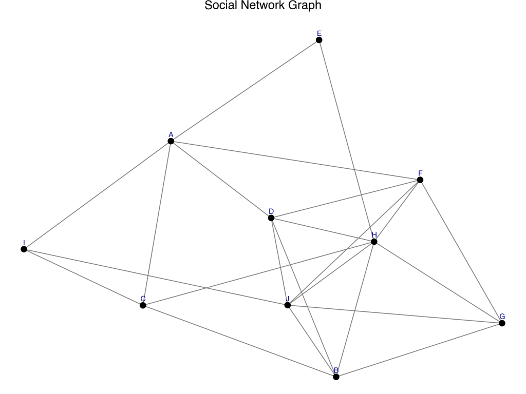
Output
Here’s the resulting social network graph:
🪄 Reflection
What worked well:
Using networkx to generate and handle the graph was surprisingly easy, and plotnine gave it a polished ggplot2-style look.
What problems I encountered:
The hardest part was getting the text labels to appear cleanly without overlapping.
Would I use this again?
Yes for small, illustrative networks this workflow is quick, readable, and produces publication-quality visuals.
Full Script :
# Libraries
import networkx as nx
import pandas as pd
from plotnine import *
import matplotlib.pyplot as plt
import os

# Create a random undirected graph with 10 nodes
G = nx.gnp_random_graph(10, 0.5)

# Give each node a label (A, B, C, ...)
labels = {i: chr(65 + i) for i in G.nodes()}
nx.set_node_attributes(G, labels, 'label')

# Use a spring layout to position nodes
pos = nx.spring_layout(G, seed=42)

# Create node data frame
nodes_df = pd.DataFrame({
    'x': [pos[n][0] for n in G.nodes()],
    'y': [pos[n][1] for n in G.nodes()],
    'name': [G.nodes[n]['label'] for n in G.nodes()]
})

# Create edge data frame
edges_df = pd.DataFrame([
    {'x': pos[u][0], 'y': pos[u][1], 'xend': pos[v][0], 'yend': pos[v][1]}
    for u, v in G.edges()
])

# Plot the social network
network_plot = (
    ggplot() +
    geom_segment(data=edges_df, mapping=aes(x='x', y='y', xend='xend', yend='yend'),
                 color="gray", size=0.5) +
    geom_point(data=nodes_df, mapping=aes(x='x', y='y'), color='black', size=3) +
    geom_text(data=nodes_df, mapping=aes(x='x', y='y', label='name'),
              nudge_y=0.03, size=8, color='darkblue') +
    theme_void() +
    ggtitle("Social Network Graph")
)

# Show the plot
print(network_plot)

# Save the image directly to Downloads
output_path = os.path.expanduser("~/Downloads/social_network_plot.png")
network_plot.save(output_path, width=8, height=6, dpi=150)

print(f"✅ Graph saved to: {output_path}")

Leave a comment